Case Study
Pro Bono Achievements
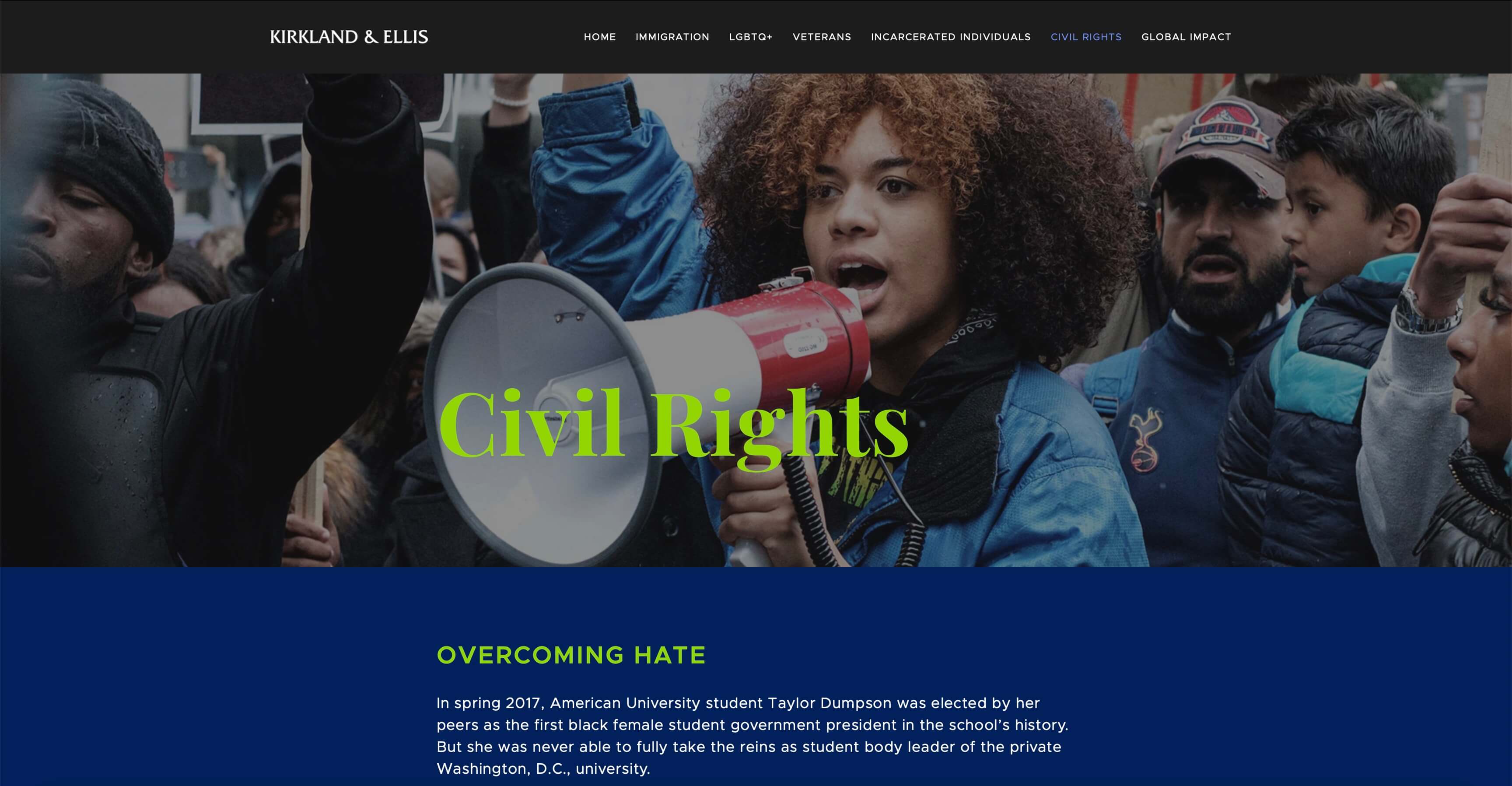
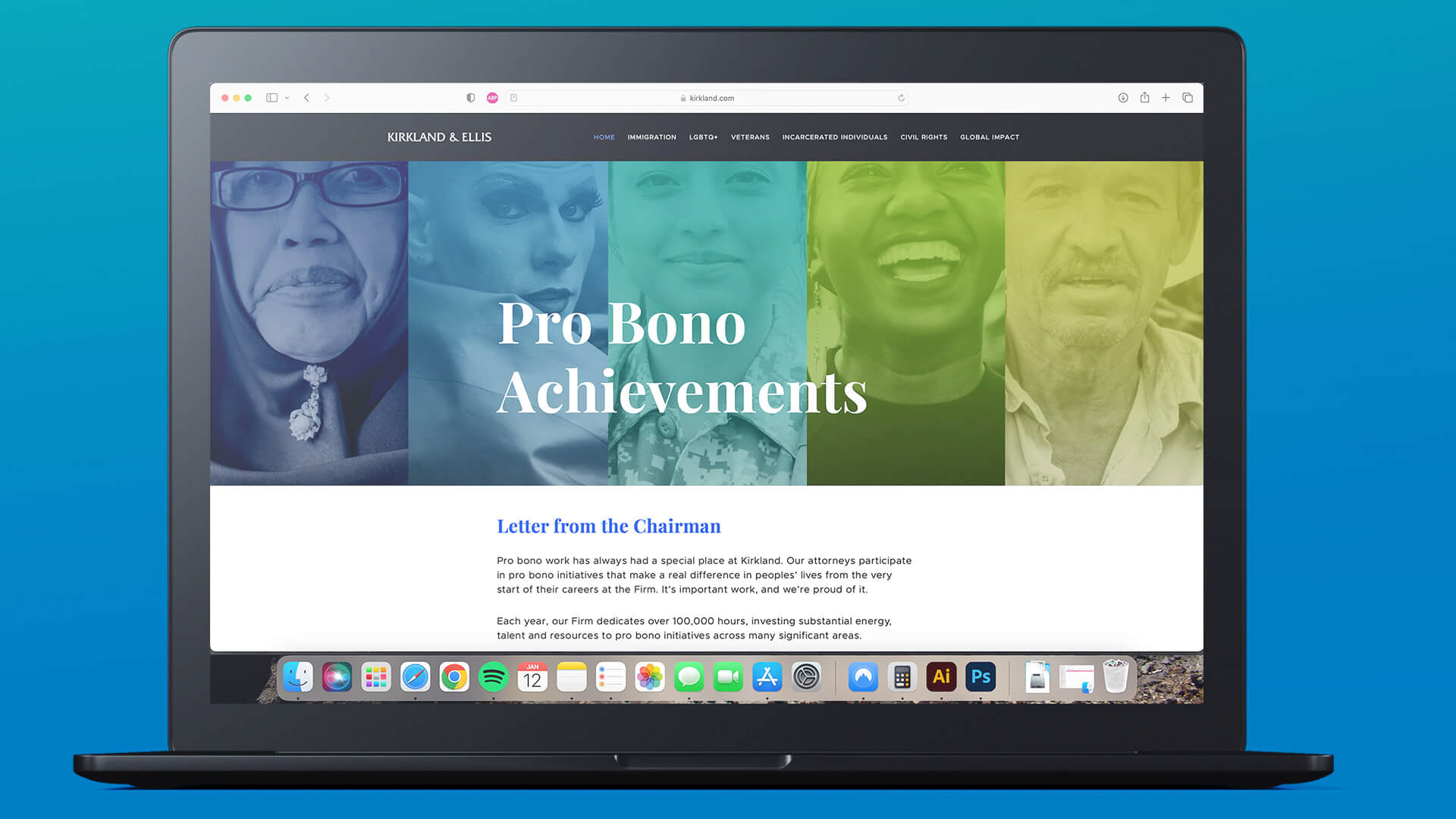
A fully responsive storytelling microsite developed to boost engagement during a time of great uncertainty. This project was a collaborative effort between Kirkland & Ellis's Branding & Creative, Communications, and Pro Bono teams.
Client
Kirkland & Ellis, 2021
Role
Art Director, Front-End Designer, Motion Graphic Designer
Background
Every other year, Kirkland would publish a book to highlight the pro bono efforts of its attorneys. Visuals for the piece were developed by Branding & Creative after receiving the copy and overarching theme from the Communications team. The finished work would then be distributed Firmwide and mailed to clients and peers in the industry.
Challenge
For the 2020 edition, our team was presented with the challenge of adapting what was usually a printed work into a digital one due to shifting budgets and priorities surrounding the pandemic. We initially considered creating an interactive PDF, but we soon realized that the format presented us with unsatisfying technical limitations.
Strategy
Inspired by the New York Times’ online longform publications, “The 1619 Project” and “The Decade We Almost Stopped Climate Change,” I pitched the solution of developing a microsite, which would give us the freedom to expand beyond text stories to include audio, video, timelines, and charts, among other interactive elements not previously possible through print.
I began as the project’s Art Director, but I also quickly found myself the front-end developer, doing a deep dive into HTML, CSS, and some JavaScript to produce the code for the site, as all of the work had to be produced in-house.
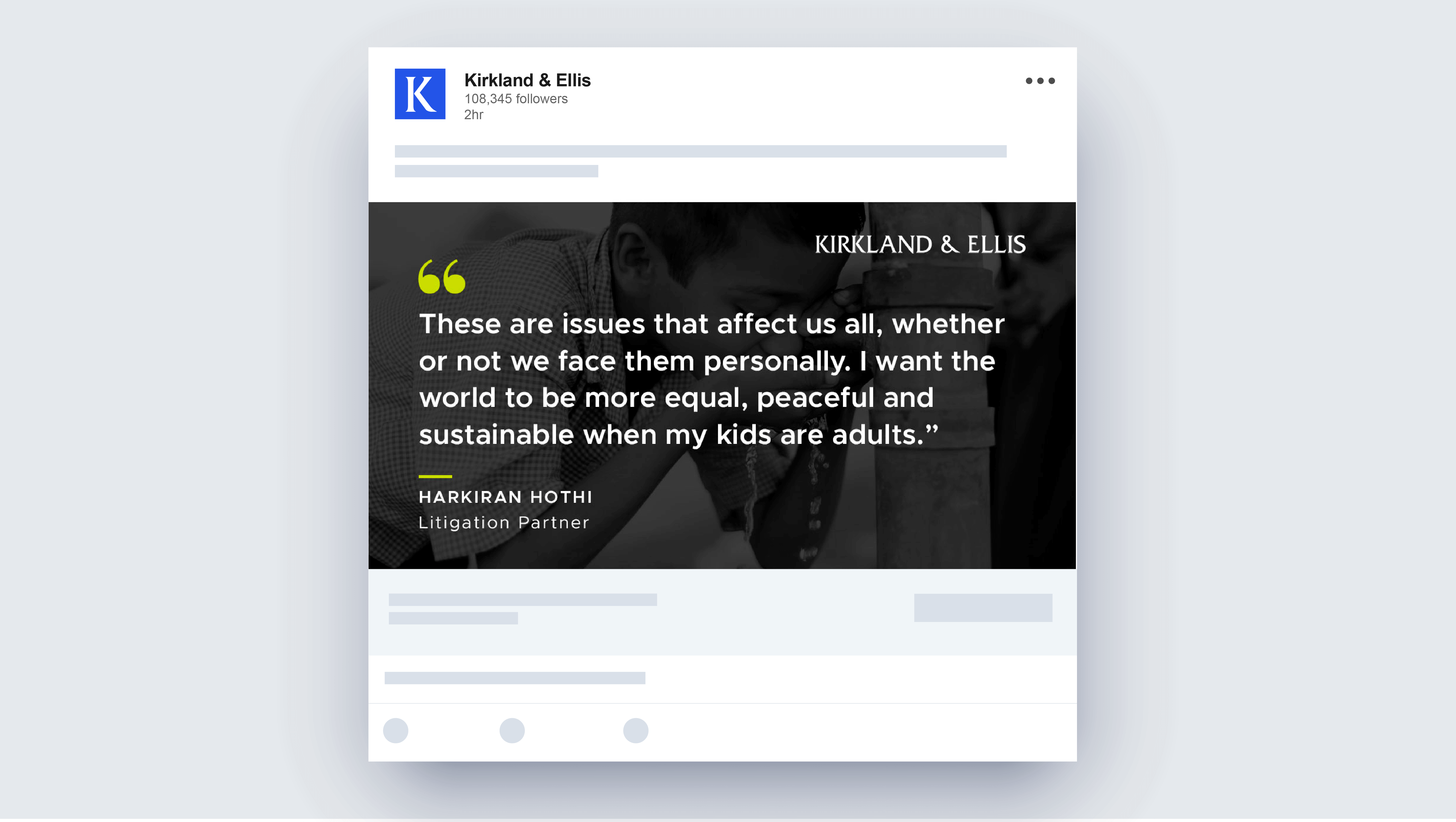
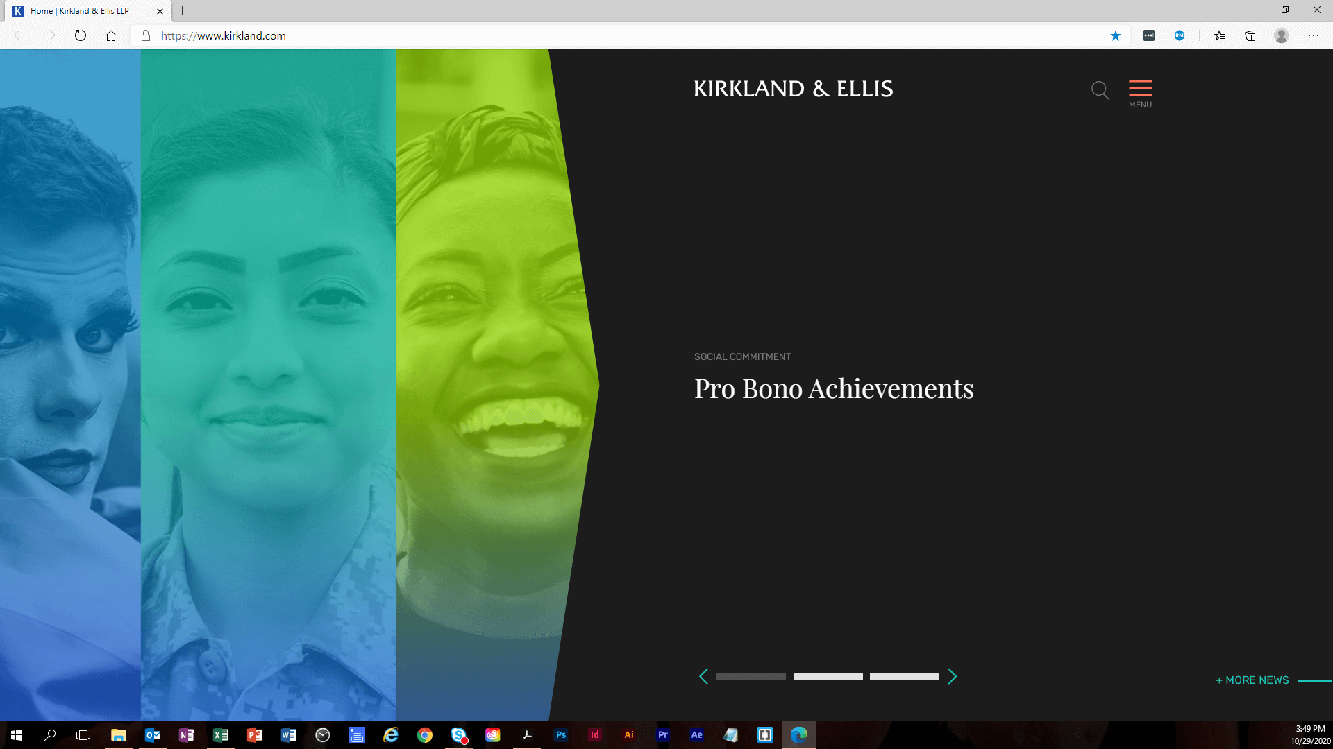
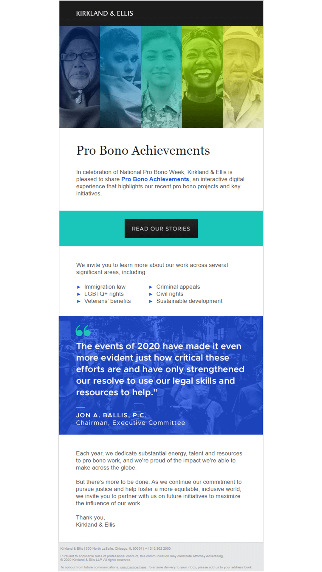
In lieu of mailing the book to clients and other recipients, an email marketing campaign accompanied the site's launch. The microsite was also featured as a marquee story on the Firm’s home page, and elements were adapted for social media channels.
Subsequent editions of the Pro Bono Achievements publication have continued in a web-based format.
Identity
Given the theme of Community, people-centered imagery is at the heart of the visual imagery. We found this even more poignant considering widespread feelings of isolation during the pandemic.
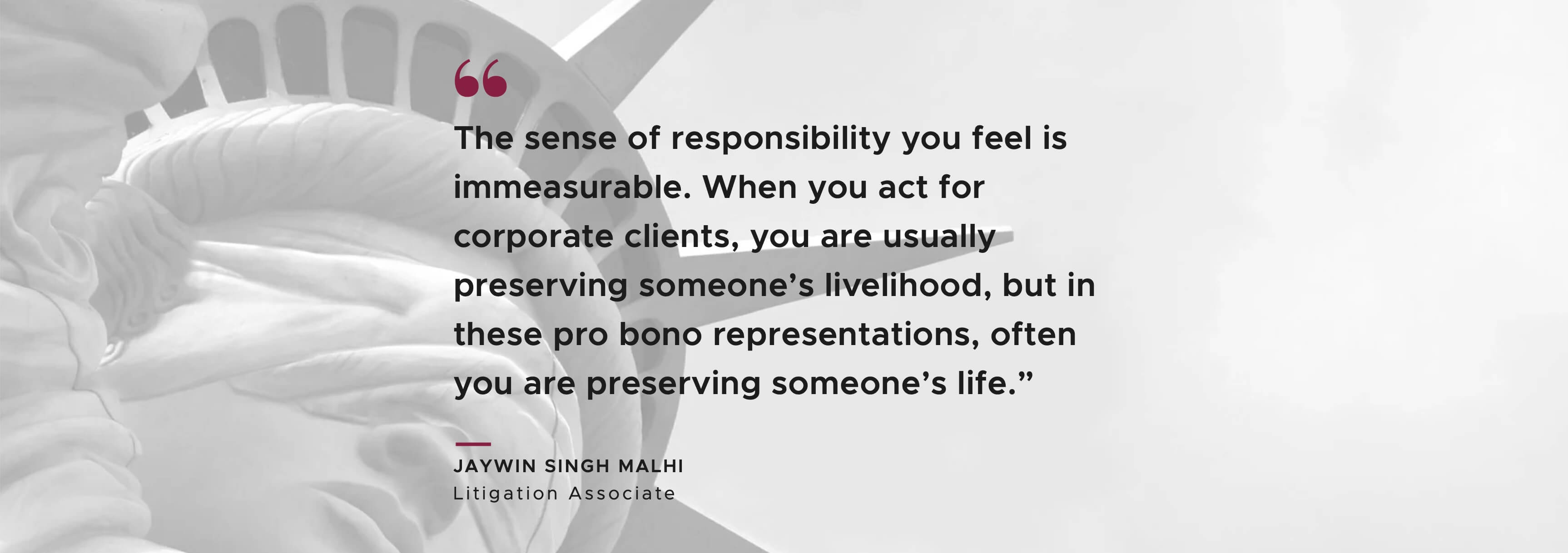
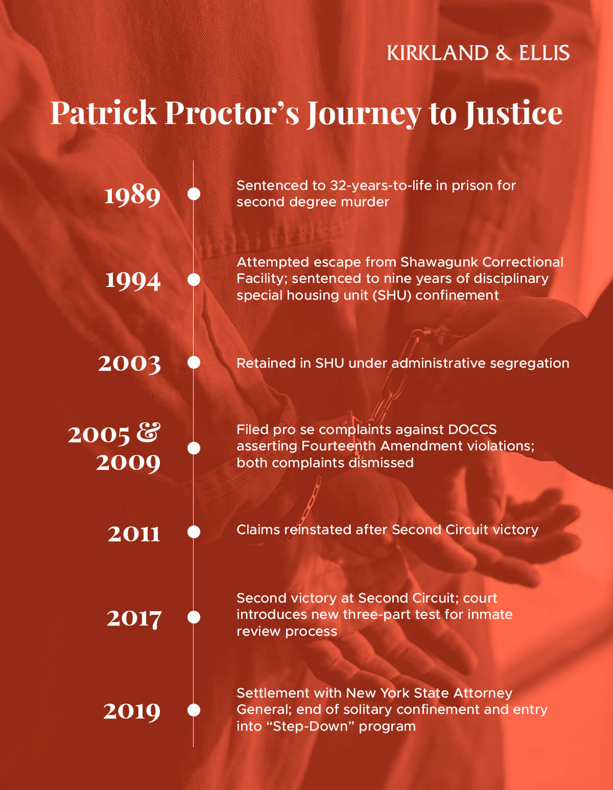
The site's colors pull from the main Kirkland palette as well as the Pro Bono sub-brand. Block pull quotes and infographics break up copy and maintain visual interest.
